Cramo is one of Europe's largest equipment rental companies, serving construction professionals across multiple markets. I spent three months embedded with their digital team, redesigning the core journeys customers use to browse, select and reserve equipment from a large, varied catalogue.
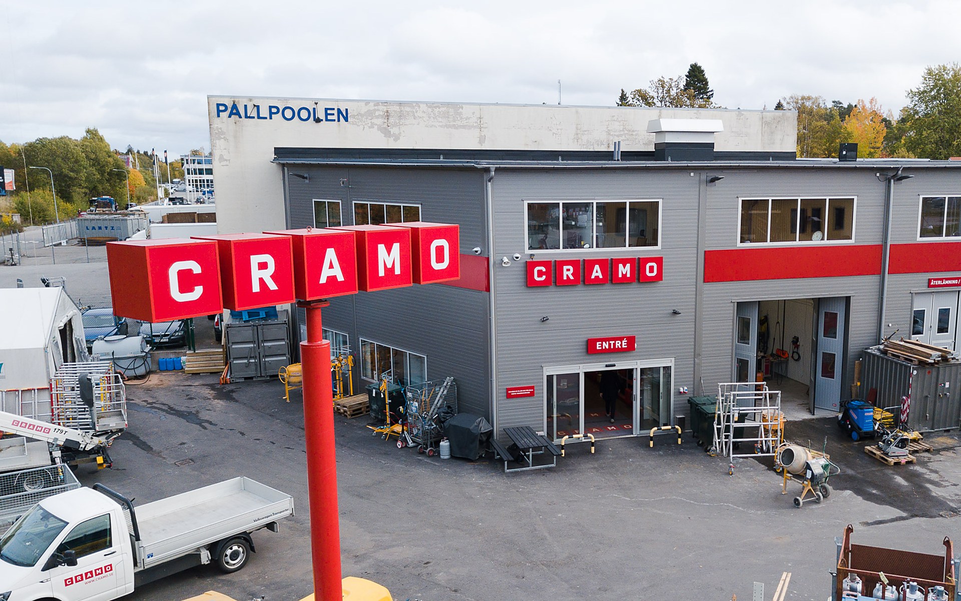
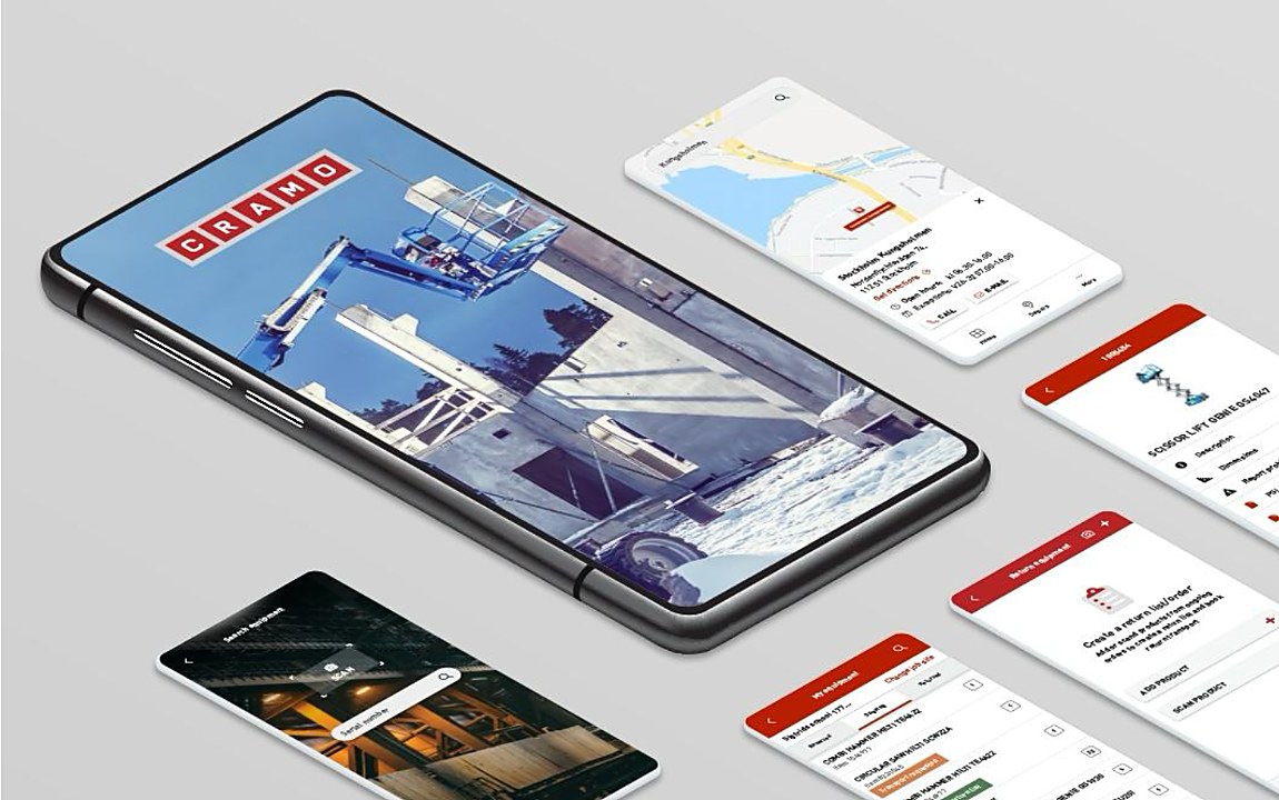

Cramo is one of Europe's largest equipment rental companies, serving construction professionals across multiple markets. The brief was to modernise the digital rental experience — making it easier to find, compare and reserve equipment across categories and locations.
This isn't a typical eCommerce journey. Customers need to find the right equipment fast, understand what's actually available, and complete a booking without friction — while browsing a catalogue that's large, varied, and nothing like a normal online store.
I worked within the digital design team on UX and visual design across desktop and mobile, redesigning the key rental journeys end to end.
Product Discovery — Redesigned product cards and filtering so customers could narrow a large, varied catalogue down to the right piece of equipment quickly.
Booking Flow — Reworked the booking steps to remove friction from reserving equipment across categories and locations.
Cross-platform Consistency — Aligned the experience across desktop and mobile so the same logic held regardless of device.
Redesigned product cards, categorisation and filtering to help customers narrow a large catalogue quickly.
Reworked the journey from equipment selection to reservation across categories and locations.
Designed the core rental journeys as one cross-platform experience.
Making a large product catalogue easier to navigate.

The redesigned experience created clearer rental flows and more consistent patterns across desktop and mobile, simplifying the complex product interactions that were getting in the way of a booking — for a business where getting the wrong piece of equipment to the wrong site costs real time and money.